In a field where we want people to act on our advice, one must have the right ingredient that catches everyone’s attention, sometimes without even saying a word. God knows how hard it can be, especially when our work revolves around getting people to change their habits. This is why when AL Consulting reached us, they knew they’re in good hands. After all, we have the recipe just for that – sass and class, and AL had that too, we just wanted to bring it out.
How It All Began
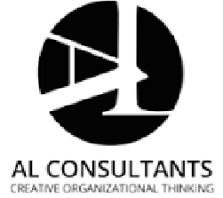
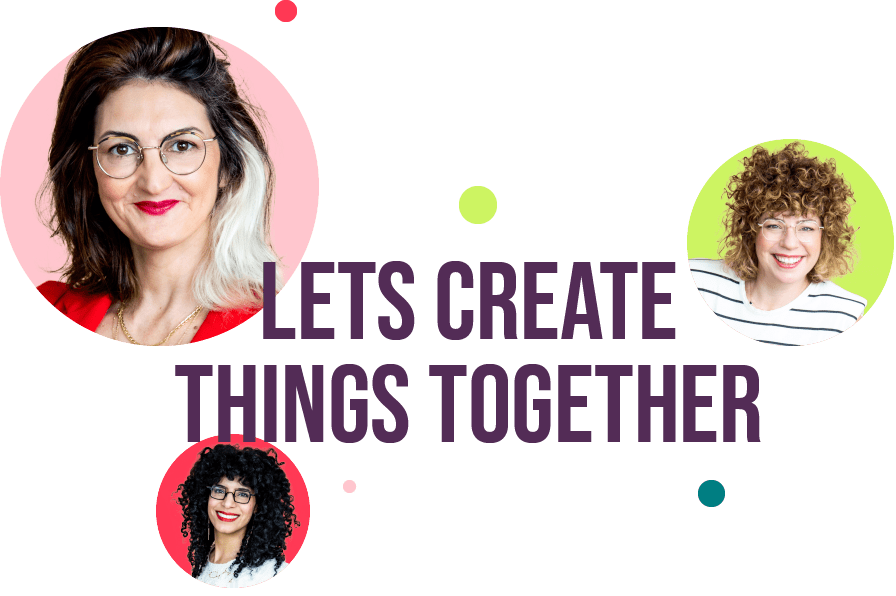
AL Consultants had a very formal identity & language, which is what you would usually associate a consulting agency with, especially one that focuses on organizational development. Nonetheless, this is not how we saw them, but rather as a group of daring women who speak out their minds and grab everyone’s gaze when they walk into a room.
Old Logo
New Logo
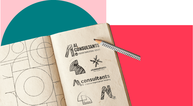
The Idea
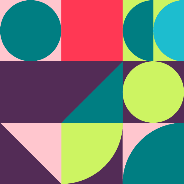
For this reason, we thought about a language that utilizes shapes, in order to invoke an interest, but also to represent AL Consultant’s activity. Shapes represent stability and provide support. With the hi-tech world being in constant change, organizational development helps companies adapt to these changes, and this is exactly what AL Consultants manage to give to their clients.
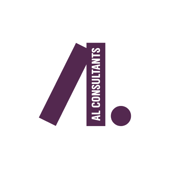
Full Logo
Symbol
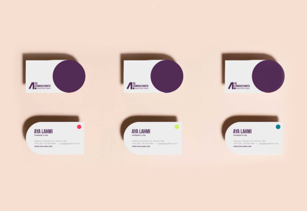
The Logo
The logo we came up with manifests the idea that support helps reach stability, with two simple quadrilaterals that combine to create a triangular character that cannot be taken down easily, they alway have each other’s back.
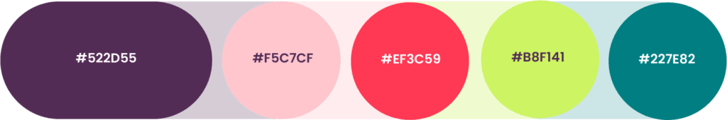
The Colors
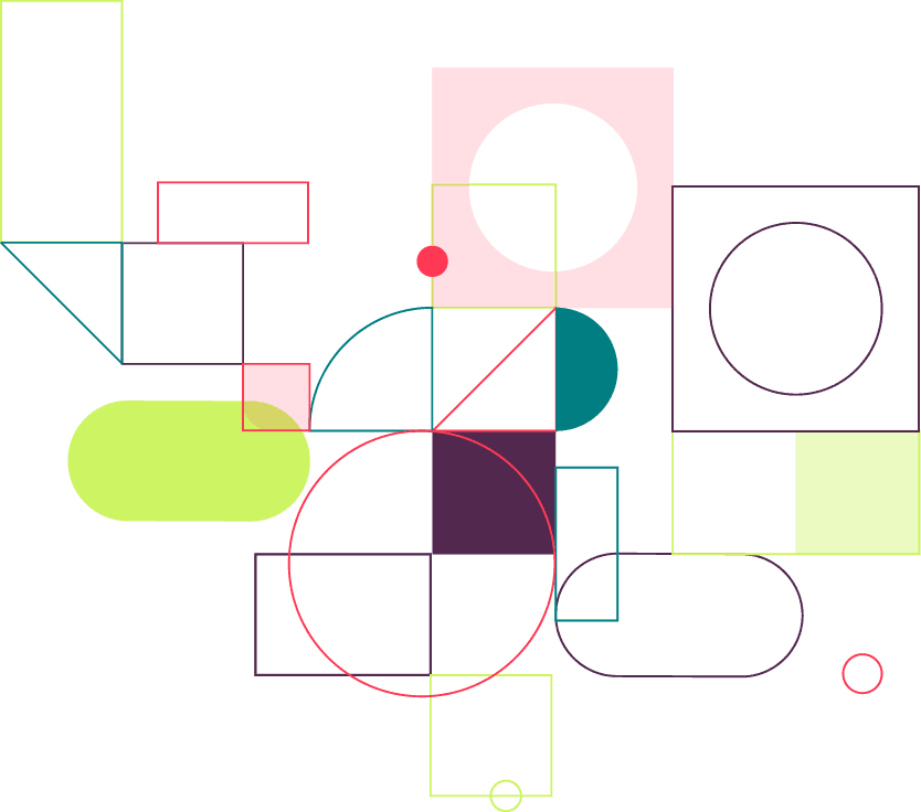
In order to convey a sassy personality, we chose to use a bold color palette that draws inspiration from “casual hi-tech”. This way we were able to fit a more daring suit to the brand, while also keeping it on the fun side.
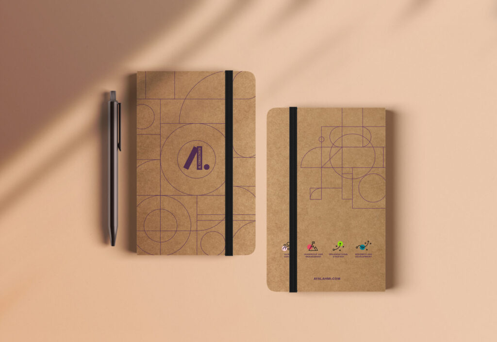
The Shapes
The dots represent milestones, they give a feeling of something complete. They are the ones that help us move from one unit to the other. All the while, they also add playfulness, giving us the full package.
The Patterns
We took basic shapes and gave them an interesting pattern that has a certain flow to it. This way we managed to take organizational procedures and turn them into sort of a child’s play. The shapes are whole
but they can also be hollow, they have range and hierarchy – and yet they are flexible enough to give place for development – nothing is permanent, just like in real life.
The Icons
All the icons are based on dots, and just like the dots, the icons also represent milestones – they are one stop on the way to the final destination. We chose to use universal icons in order to keep it simple, as we did with the logo.
Social Media
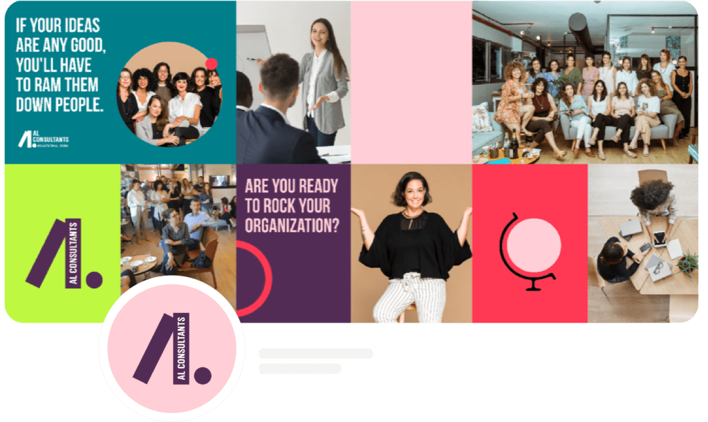
We planned an Instagram grid in the shape of a bulletin board in order to convey multiple messages. If you’ve worked with us before, you should know that on social media you have to keep it short while still being informative.
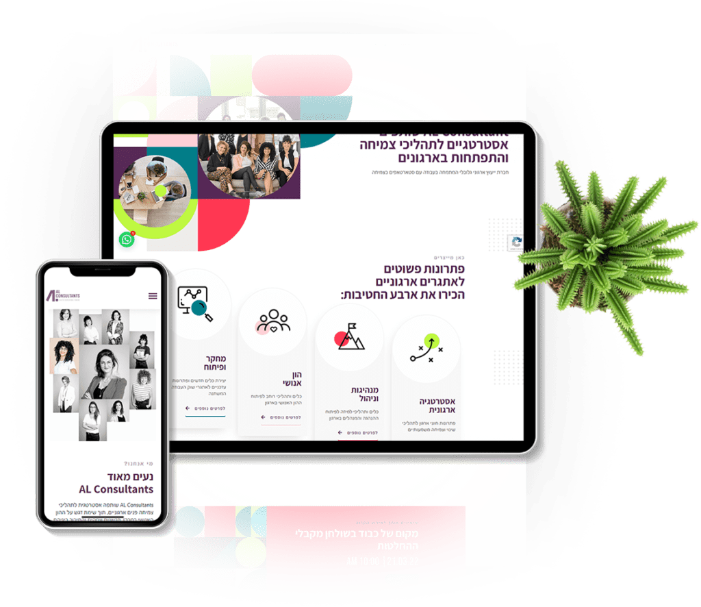
Website
We chose the website to be the main platform where all of AL Consultant’s messages and values are, while also using animations to bring the entire language to life.
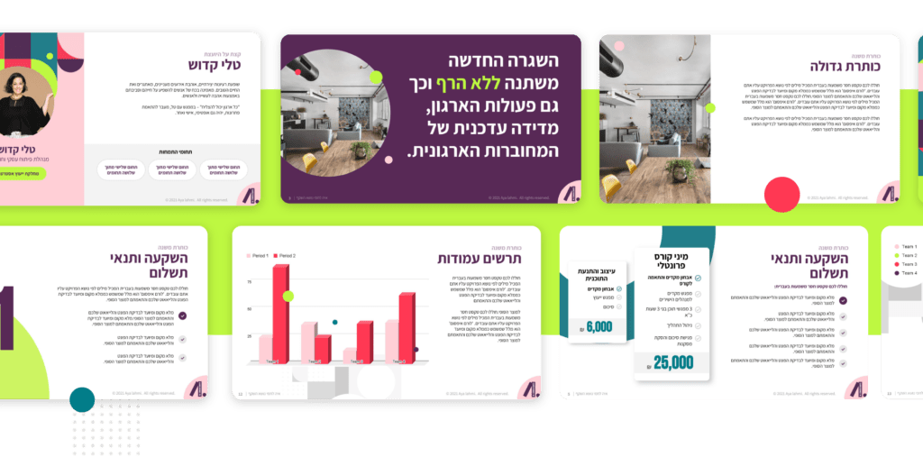
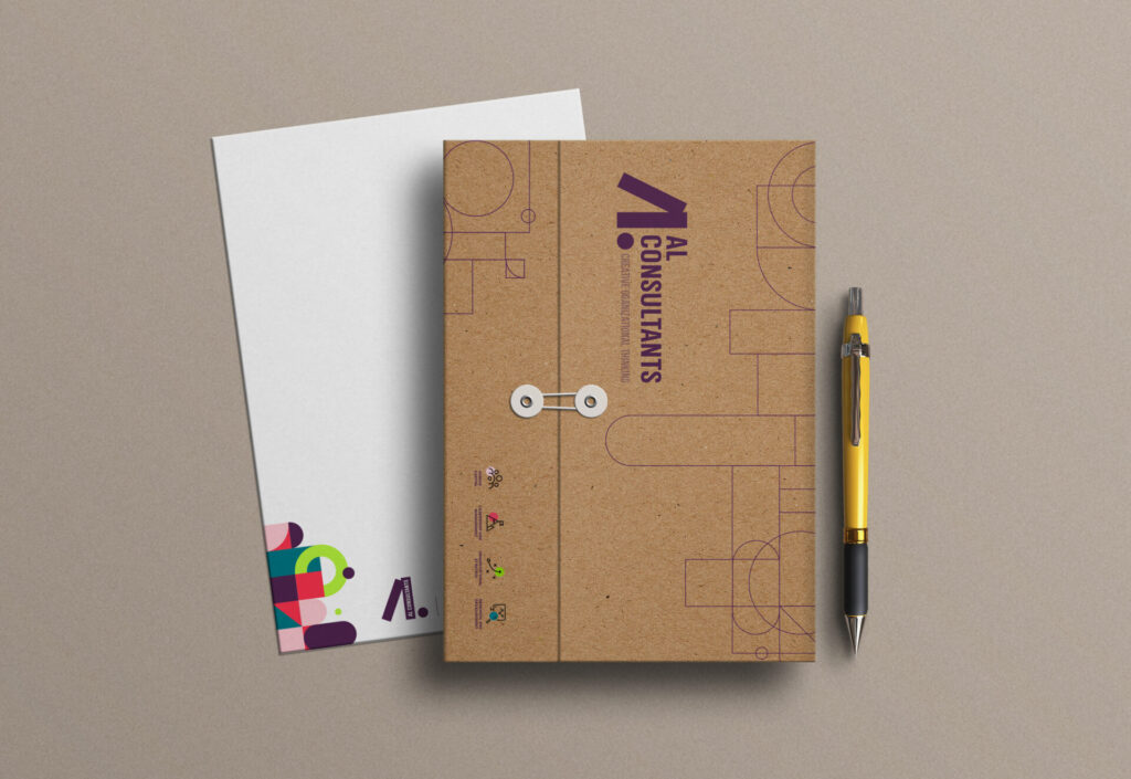
We usually do everything online, but we were so proud of what we’ve come up with that we just had to put it on some merch! All of AL Consultant’s merchandise include an interactive presentation that emphasizes the brand’s values.